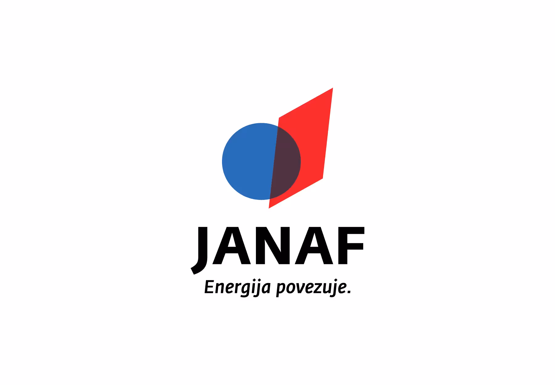
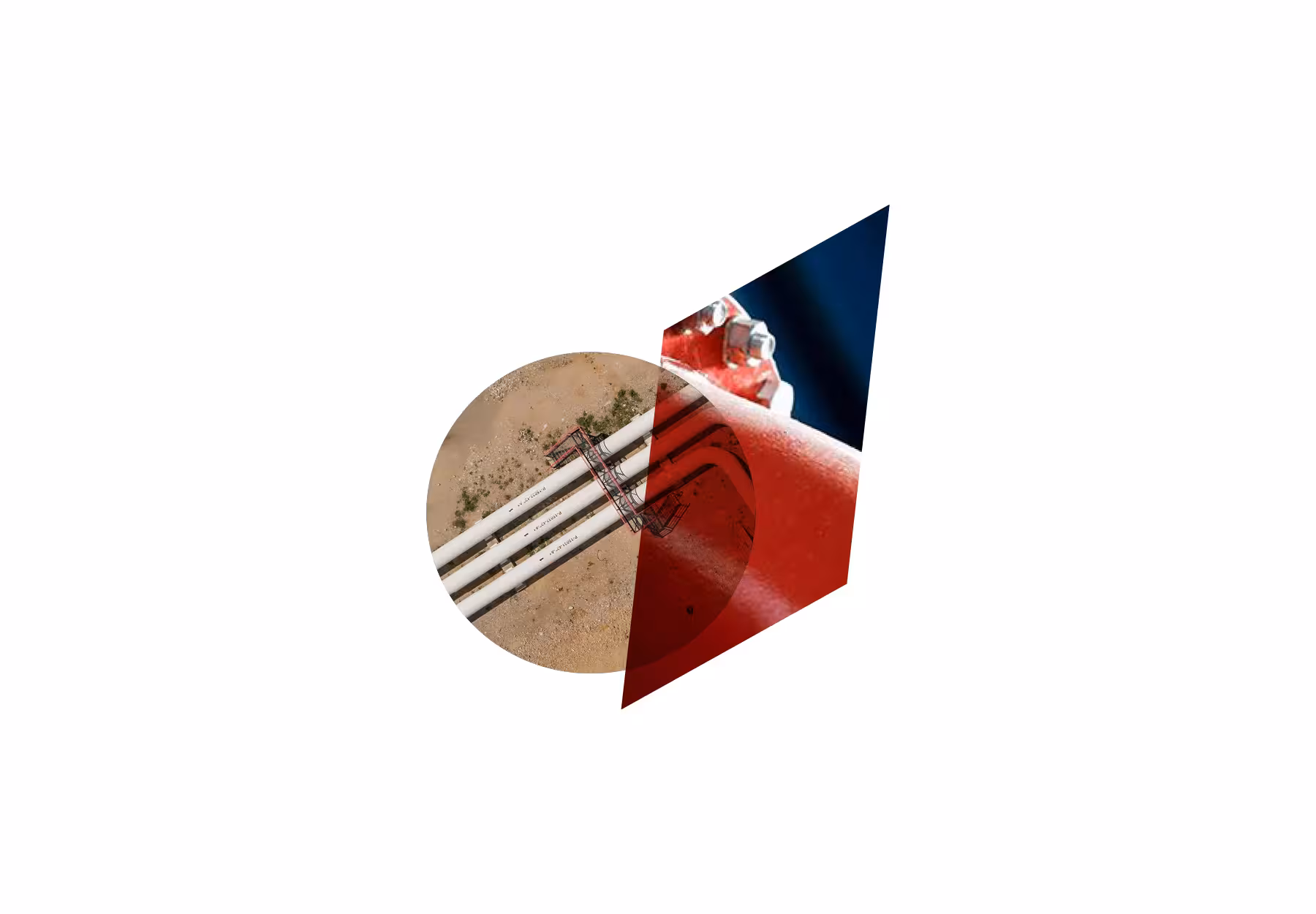
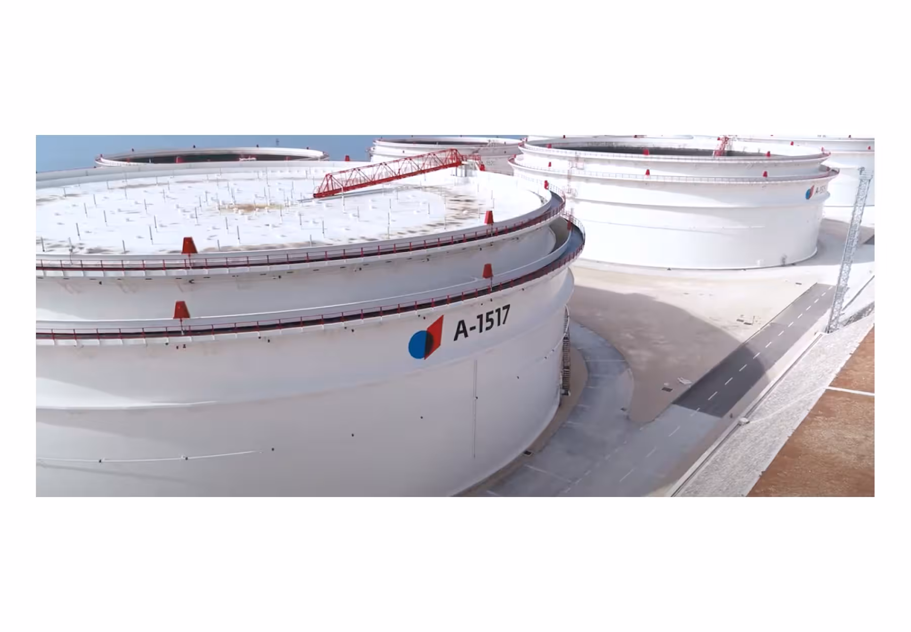
The visual identity of JANAF is built around the idea of connection a reflection of the company’s extensive oil pipeline network that links Croatia with the broader European energy system. Through a carefully developed graphic language, the logo communicates JANAF’s strategic role as a vital infrastructure partner enabling secure and efficient energy transport across regions.
The central graphic element symbolizes this connectivity. The blue circle represents Europe, emphasizing international integration and cooperation within the European energy network. At the same time, the circular form can be interpreted as a cross-section of an oil pipeline, directly referencing JANAF’s core activity and technological expertise.
Intersecting the circle is a red square, a symbol of the Republic of Croatia. Rather than appearing static, the square is positioned dynamically, expressing movement, progress, and a forward-looking vision. This interaction reflects Croatia’s active role within the European energy landscape.
The overlapping of blue and red creates a tone reminiscent of oil itself, symbolically representing energy as the outcome of connection, flow, and collaboration. Through this visual synthesis, the JANAF identity communicates reliability, strategic positioning, and the continuous movement of energy shaping the future.
Client: Janaf d.d., Kadei
Year of realisation 2018 for visual identity / - 2026 for branding.