Brand identity for a regional payment solution
The name Monri originates from the fusion of two core ideas - money and river - symbolizing the natural flow of financial transactions in the modern digital economy. Just as a river moves continuously and connects landscapes, Monri Payments enables seamless movement of value between businesses, customers, and financial institutions.
This concept of flow stands at the center of the brand identity. Payments are no longer static transactions but dynamic digital streams that must be fast, secure, and frictionless. The Monri logo visually reflects this philosophy through fluid forms and continuous motion, representing reliability, technological precision, and uninterrupted connectivity.
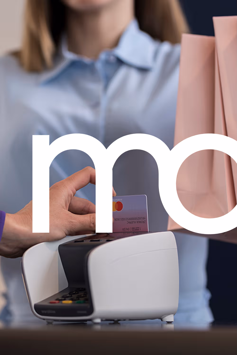
The logo represents movement rather than structure - a deliberate contrast to traditional banking symbolism. It communicates agility, omnichannel connectivity, and constant data exchange across physical and online payment environments.
As a regional fintech leader processing millions of transactions daily across multiple markets, Monri embodies a living financial network where technology enables uninterrupted economic interaction.
Art direction Tanja Prlenda
Photography: Domagoj Kunić
Year of realisation: 2018.